
There’s a little piece of advice that has stuck with me since I was young and going to all the summer art day camps I could in junior high. I don’t remember where I heard it or who I heard it from, but someone somewhere said something resembling, “Art is not interesting because of what’s in it but because of what’s not.” Odds are that’s not even what was said, but now, years and years later, that's what I remember. If anyone has heard it before and knows where or who it is originally from, please let me know!
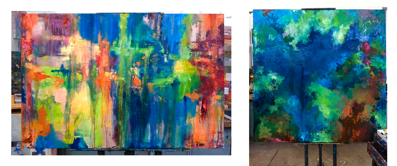
I stick by this quote in my work mostly in regards to color. Everyone has different tastes, but I am always drawn to color palettes that do not contain every color in the rainbow. By limiting your color options, every color chosen for a piece becomes more deliberate and thought out. In abstract art, color is everything, and the way they interact within the composition can make or break a piece. Here is an example. The piece on the left is a painting I did in college. Whatever I knew about limiting my palette took a vacation, and in trying and trying to finish it, I just kept adding bright colors and more bright, fullly saturated colors. I was left with this painting I never liked. However, the piece on the right is another one I did my senior year at TCU, and it’s one of only a few I have kept from my BFA days. Composition differences between them aside, the one on the right is heavy in blues and greens and has areas of different levels of tone and saturation within that. It has other areas of browns and rust colors and pinks which offset the blues and greens, keeping the piece very colorful, but still limited to a definitive color palette.
As in every “official art rule,” there are always exceptions and ways to successfully break this rule, but in my experience, this mindset of limiting yourself from the beginning of a piece makes is easier to make informed and purposeful decisions about color.
There are two ways to utilize the concept of limited palette. The traditional approach in oil painting is to limit the colors of paint you put on the physical paint palette where you are actually mixing the colors to be used in the painting. This forces you to mix colors, and by not having so many types of pigments to fall back on, you focus more on the subtleties of tone and color temperature in the paint you apply to the canvas. The second approach, which I focus, on is limiting the colors that will be visible in the finished piece. I like to lay out a few ground rules for myself when I begin each piece, such as this piece will have no yellow shades of green and no oranges, and all blues will be muted and on the red/purple end of the spectrum. That simple thought process still leaves me with many colors and combinations to choose from, and immediately gives me something to respond to aesthetically, preventing the age-old dilemma of a blank canvas.

Anders Zorn (1860-1920) was a Swedish painter known for his use of a limited palette. Most of the time, he only used these four colors: Lead White (Flake White), Yellow Ochre, Vermilion, and Ivory Black. He was a portrait painter, and these pigments served him well. His choice of black pigment was specially significant because ivory black has blue tones to it; so he was able to make a whole range of flesh tones from pale pinks to deep browns with the ability to have cool blue-greys and olive greens to balance it out. It is a very challenging palette to stick with these days when we can run to the nearest art store and find an overwhelming amount of pre-mixed colors, but the spectrum created by his special palette is beautiful. In Zorn’s self portrait to the left, you can see the colors on his palette. And while he is famous for his palette, he was also known to use other colors of paint on occasion when the subject matter or individual piece called for it.
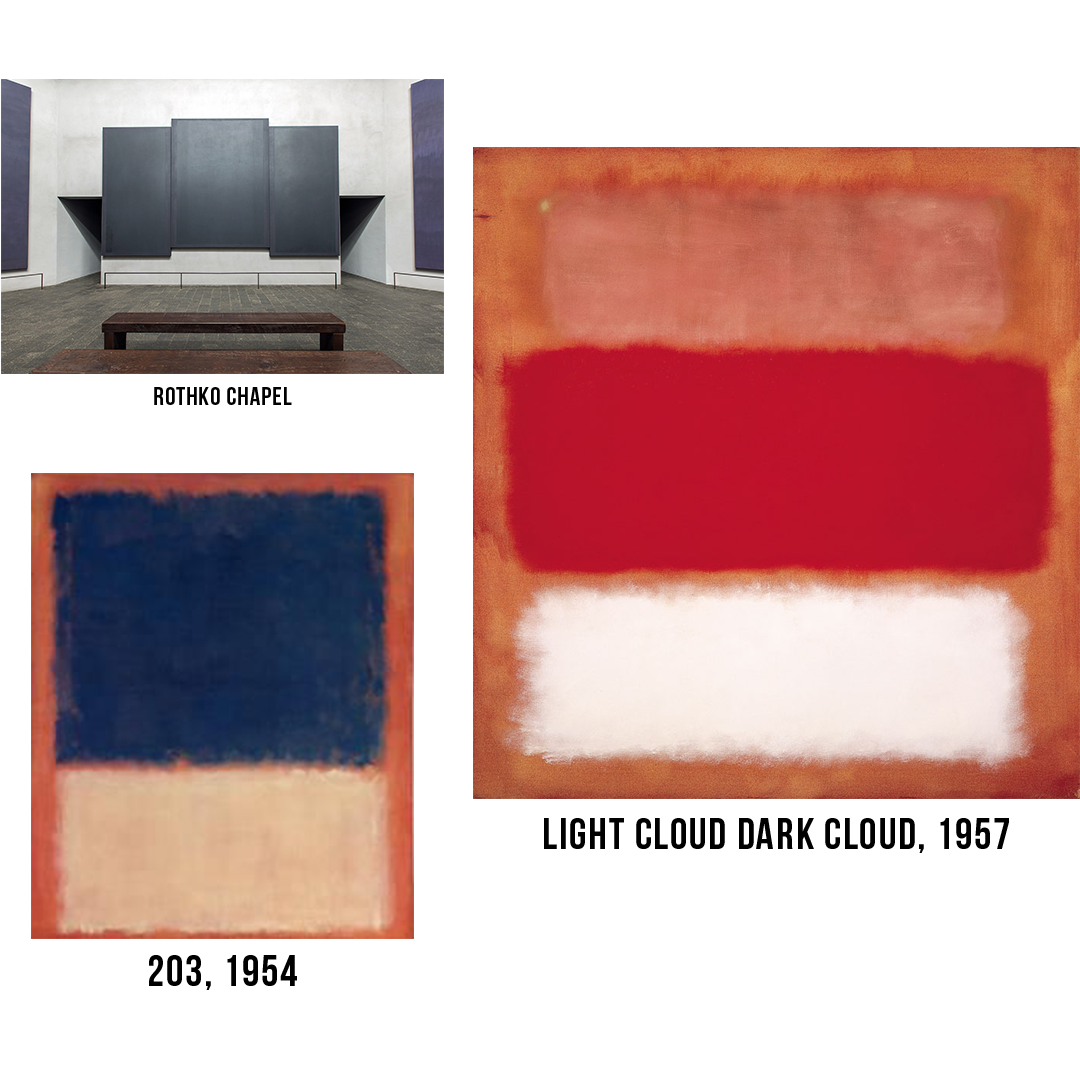
Mark Rothko (1903-1970), an American Abstract Expressionist painter is most known for his paintings with big freeform rectangles of color contrasting with or contemplating other large areas of color on the piece. They are a prime example of using a limited palette with the end result in mind. Each piece, including the minimalist black paintings hanging in the Rothko Chapel in Houston, Texas, have a very deliberate and pre-planned color palette that was obviously conceived before the painting was begun. They are a great demonstration of how colors can play against each other and how the ratio of large amounts of one color to smaller amounts of others can affect their perception.
Next time you look at a piece from art history or a post from your Instagram feed, ignore the content for a few minutes and take the time to really look at just the colors and pigments used, and note the colors that are not there and why it was a good decision to leave them out. Van Gough's Starry Night has a very specific blue, yellow, and black color palette while Monet's The Houses of Parliament has a palette that includes pinks, oranges, yellows, and blues that are all muted and pastel. Contemporary photographers who have access to technology that can produce photos with bright vivid colors will still often choose black and white, limiting the palette of the image to draw the viewer's attention to tone and subject matter. Instagram filters take the pictures from your phone and change their palette, shifting it towards the cooler or warmer end of the color spectrum. The concept of limited palette is seen in practice everywhere, and most artists practice it, whether they are aware of it or not. Next time you start a piece, give some forethought to the color palette you want to use. And next time you are stuck on a piece, think what color should I take out, rather than thinking what color should I add? When you find yourself in the paint aisle being overwhelmed by all the long names like phthalocyanine or quinacridone and multitudes of types of pigments that look all the same on a label, take a deep breath and rule them out instead of convincing yourself you need ALL THE COLORS! (Unless it just really pretty. Then buy it anyway, and use it wisely and with as few other colors as possible so that it won't get buried.)